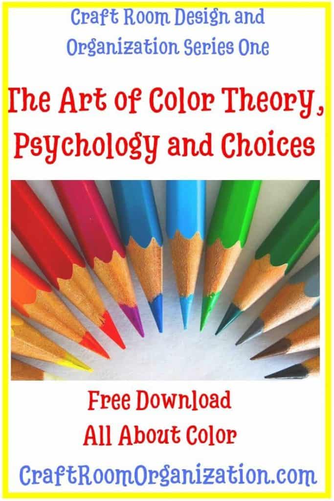
We talked about the importance of getting ready to design your perfect Craft Room in the last post. The art of color theory is next.
For series one we are going to learn all about color. Color Theory, Color Psychology and Color Choices. Who knew that color had such an impact on the overall design of a room. This applies to any room in your home or even your office. Once you nail the color, it makes it easier to pick your furniture and accent pieces.
Many people consider there to be a psychology that surrounds color. With each color evoking emotion and feelings.
Colors and the Psychology they evoke
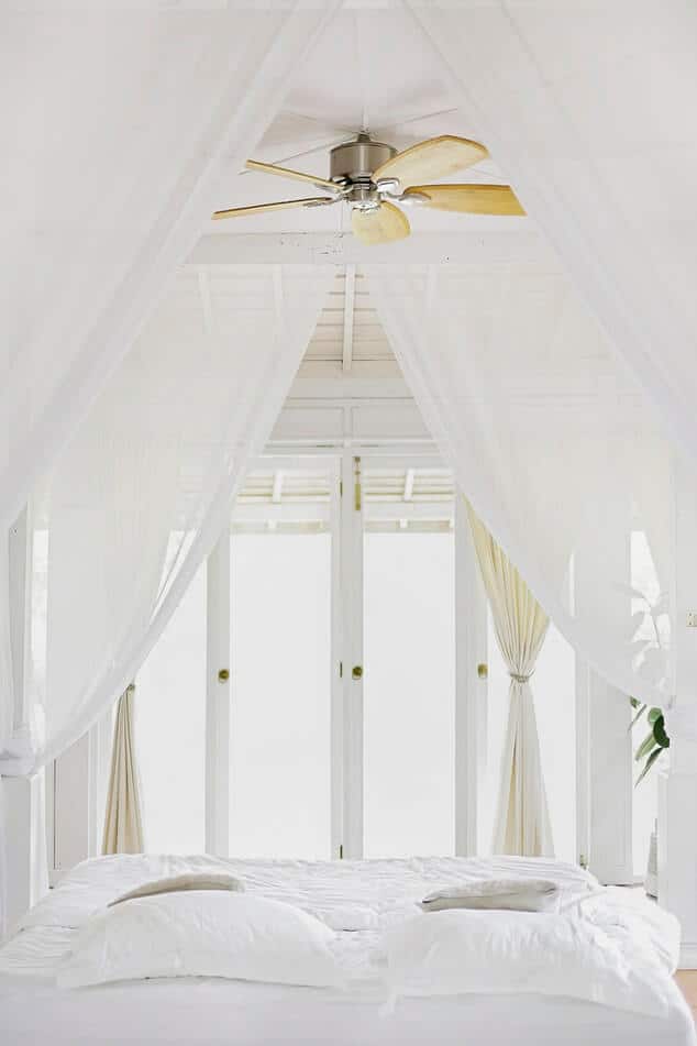
White – A sense of purity. White brightens and creates a sense of space. It evokes cleanliness, freshness and simplicity.
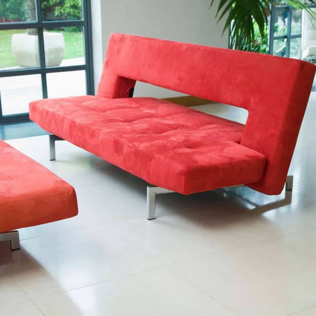
Red – If you want energy in your room then paint it red. Red evokes a spike in adrenaline due to its intense color. It is a warm color associated with warmth and comfort.
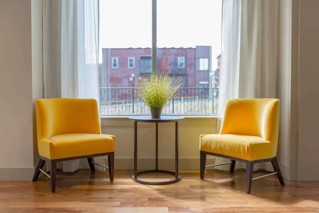
Yellow – The use of yellow brings happiness and uplifting feelings. It is also a warm color. Yellow is the most fatiguing color to the eye due to the high amount of light reflected.
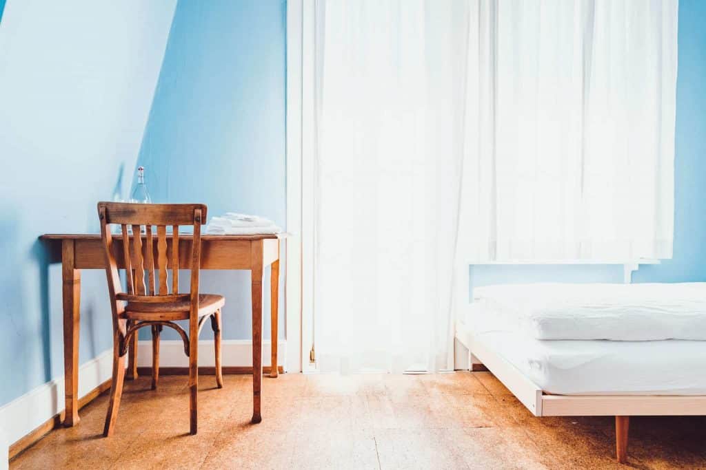
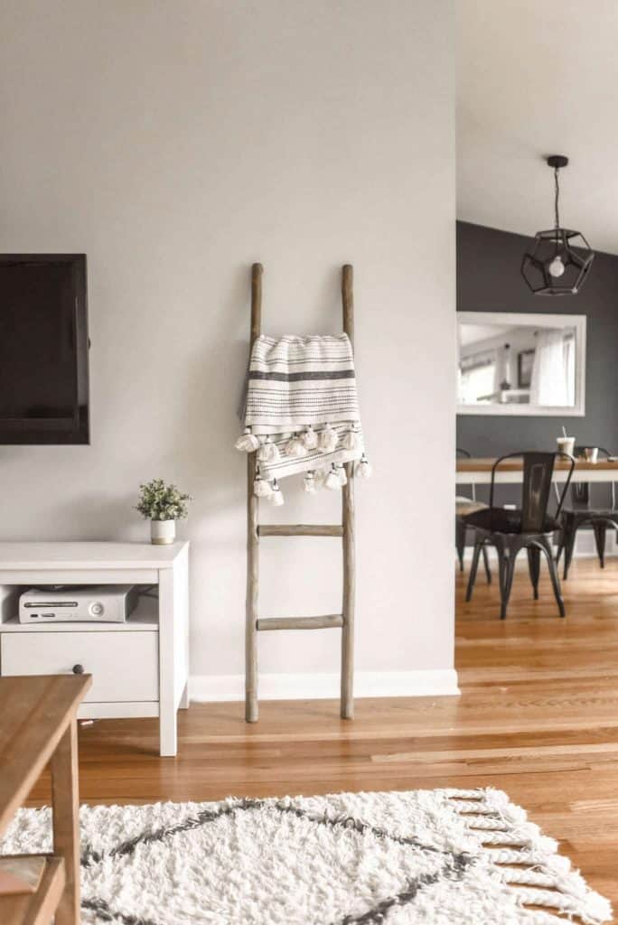
Blue – Calmness, relaxing and serenity. It brings about feelings of peace, tranquility, security and order. Blue is used in craft room as studies have shown that you are more productive in blue rooms.
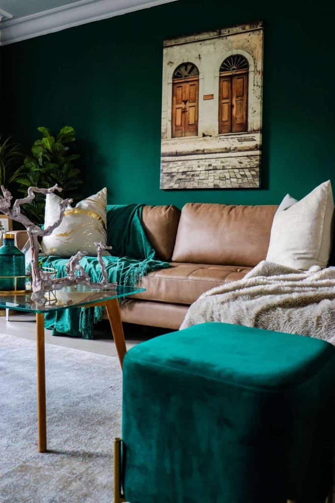
Green – The use of green can be for any room in the house as it is considered the most restful color. It is thought to relieve stress.
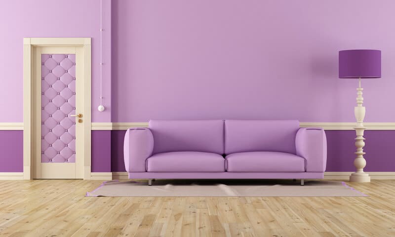
Purple – For a dramatic and sophisticated look use dark values of purple and soft purples of bedrooms. It is also a soothing color.
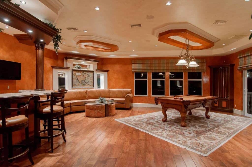
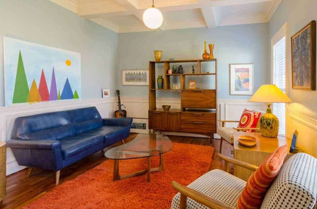
Orange – For energy and excitement use orange in rooms such as an exercise room or craft room.
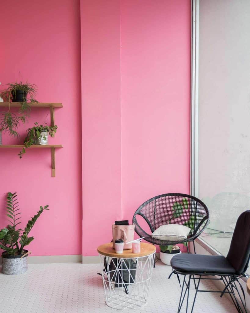
Pink – Creative and artistic is used to describe pink. It is vibrant and refreshing and evokes feelings of joy and happiness. Photo by Stefen Tan on Unsplash
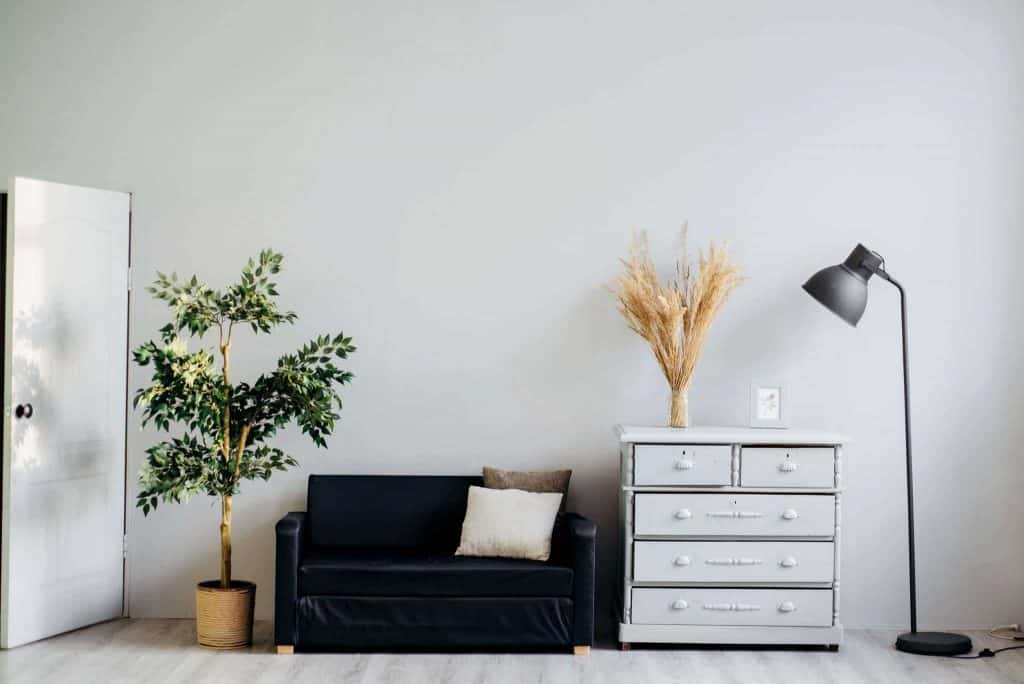
Neutrals – The basic theme for when you want flexibility. You can use any color as an accent and change out as fashion trends change. You can liven up a room or calm it down just by changing the accent colors.
Once you’ve decided on a color for your walls it’s important to then choose your accent color or colors. For that task I recommend reviewing the basics of the color wheel. The color wheel provides you with the visualization of complimentary color schemes making it easier for you to choose your accent color or colors.
Get this handy Color Guide for FREE. Laminate it and take it with you when you shop for colors so you can easily pick the right ones!
The Color Wheel
This color wheel is a very good reference to understand the basics of color. Kathryn Costa designed this wheel to use to create her beautiful and colorful Mandalas. You can visit her site at www.100mandalas.com
Primary colors are Yellow, Red, and Blue. These three colors cannot be made by mixing other colors. From those three colors, we get the Complimentary, Secondary and Tertiary by mixing. As you can see in the color chart.
Complimentary colors are the direct opposite color on the wheel. Orange, Purple, Green are made by mixing primary colors together. The complimentary colors are usually used in the background to emphasize the color used in the foreground.
Tertiary colors are the six shades that can be made by mixing the primary and secondary colors together.
Analogous scheme are the colors on either side of the base color. They are harmonious and often found in nature. They are pleasing to the eye. Using these colors create comforting design.
Triadic scheme uses an equilateral triangle to determine the three colors. This scheme is considered to be the best for design by using one color for the background and the other two for accents.
Two handy tools to preview colors together before you buy
Material Palette You pick 2 colors and it auto generates a color palette for you. They are identified as primary, light primary, dark primary, divider, accent, primary text, secondary text, and text/icons.
You pick 2 colors and it auto generates a color palette for you. They are identified as primary, light primary, dark primary, divider, accent, primary text, secondary text, and text/icons.
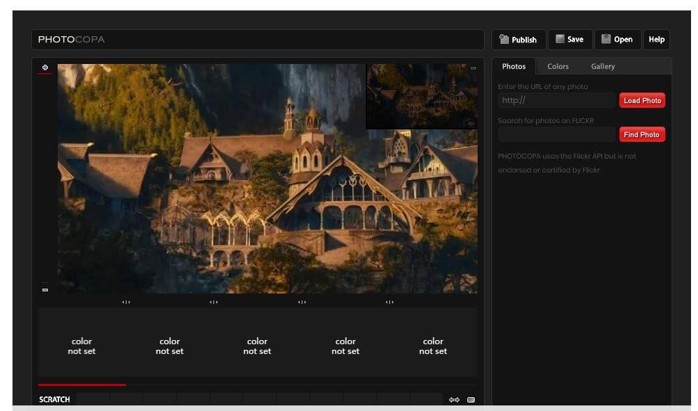
Colourlovers.com You have to sign up and login to create a palette. Once you are there you will see several different ways to find color. If you have an inspiration photo you can upload it (see below how to do that) and it will generate all the colors from that photo and give you different palettes along with the color codes.
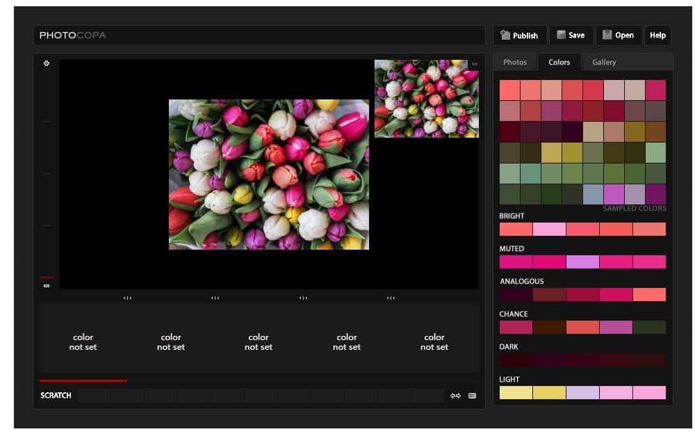
Tulips Photo by Gábor Juhász
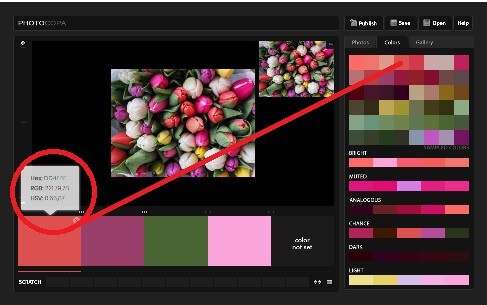
When using these types of tools you will see that there are different versions of the color.
Color Techniques:
Tint – adding white to lighten a color
Shade – adding black to darken a color
Tone – adding grey to slightly darken the color
Lastly, with all this in mind, understanding color temperature is also important.
Color Temperatures
Warm Colors – Reds, yellows, oranges are warm colors. They add liveliness to a room. Use these colors in larger rooms as they tend to close in smaller rooms.
Cool Colors – Blues, purles and most greens are cool colors. They evoke calmness and relaxation. Use these colors in smaller, more intimate rooms.
Choosing Accent Colors
It can be overwhelming to say the least! Often we choose a color because we are simply drawn to it and that’s ok! What makes your choice even more pleasing to you and others is what you accent your choice with. Why not add a pop of color to balance your room? Now you have the knowledge of how colors make you feel, how they are made, and more, but what do you choose as your accent colors?
Complimentary colors such as red and green, blue and orange, or yellow and purple are often the easiest colors to use when decorating. One becomes the dominant and the other the accent. That’s easy right?
Because the colors are high contrast, you could mix them in with neutrals. So if you have tan, white or grey walls use the complementary colors as accents. It softens the bright colors and also gives the room a pop of color instead of being overwhelmed with color.
If you are not into boldness, then choose your first complimentary color as your foundation and add two colors on either side of its opposite color. Such as a muted or light blue with a pop of red-orange and yellow orange.
If you choose Analogous colors, then use the 60-30-10 rule. Choose your base color, then one to support it and the last to vibrantly accent it. Neutrals are often used in this manner. White is the dominant covering 60% of the room, gray is used in 30% and black is the pop at 10%.
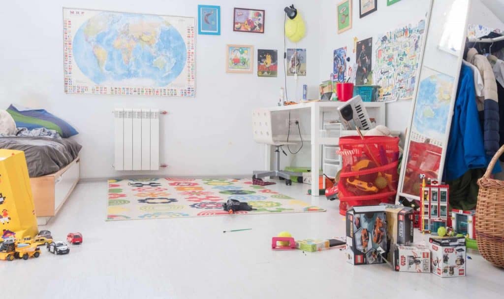
Using the Triadic colors results in a dramatic and bold statement. These colors are often found in child’s playrooms or game rooms.
Remember this post by Pinning it to your favorite Pinterest Board!
In Conclusion
I hope that leaning the art of Color theory, psychology, and choices gives you a bit of help when choosing colors for your Craft Room or for any room in your house! For my craft room I chose a nice teal and my contrast will be bright bold Primary colors. I want to be inspired when I go in there and feel happy and bright! You will see the colors I chose in the next series on Prepping and Painting your Craft Room.
What is your favorite color? Did this help you to decide on a color scheme for your next room? Let me know in the comments!
Check out the Series Here:
Series One: The Art of Color Theory, Color Psychology and Color Choices
Series Two: Prepping and Painting your Room
Series Three: Choosing your furniture, shelving and lighting
Series Four: Craft Room Organization and Storage Ideas
Series Five: Special consideration for Crafts that require ventilation
Series Six: Organizing your Space
Series Seven: 7 Tips to Keeping a Clean Craft Room